
The Psychology of Colour
Winter is now under way and it is a great time to consider the psychology of colour as a powerful force in your home. Colour has long been known for impacting on our emotions and psyche. It is easy to feel a little gloomy in the midst of a long Winter. Experiment with colour and help lift your spirits and brighten even the coldest of Winter days. Let’s take a look at the best colours to warm you from the inside out this Winter.
Warm, deep tones are the key to adding warmth to your home during Winter. Using reds, oranges and yellows in your home paint décor can make the home seem more welcoming from the outside or warmer on the inside – especially during the winter. If you are selling a home during the winter and are planning to paint, keep this in mind. If painting is not an option use the below colours in artworks, cushions, rugs or accessories around your home. Be careful to chose the right colour to go with your existing colour scheme.
Orange and yellow hues, for example — raise the perceived temperature of a room. For that reason, they’re best used in rooms that would ordinarily be quite dark and don’t get a lot of natural sunlight. These colours are known for inspiring activity, therefore it is best to avoid them in rooms meant for relaxation, like the bedroom.
Orange is a nurturing colour and works wonderfully as an accent colour in a room, thinnk cushions, throws or artwork.
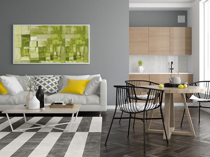
Yellow is known for inspiring optimism -perfect for Winter wouldn’t you say? As you might expect, yellow is a great colour for a sun-room. However, yellow works wonders for a homes entryway or enclosed front porch. As you leave for the day to go to work, the yellow paint in this area will give you one last boost of optimism before the daily grind begins. Similarly it will lift your spirits when you return home from a long day at the office.
Red raises the energy level of a room, but it may also make people more irritable and hostile — so it’s not a good choice for a child’s room. Use it as an accent rather than a base room colour. It is used in kitchens to increases appetite. Grey on the other hand should be avoided for the dining area and kitchen — unless you want to dampen your appetite.
Brown is a warm, masculine, comfortable colour. A great colour for a large couch and works well with all warm contrast colours such as orange, deep reds, gold, green and black.
Enjoy exploring colour this winter.
